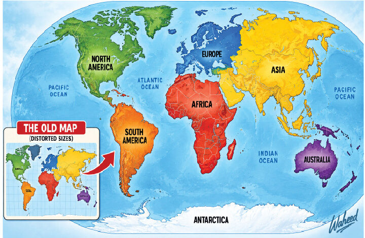
For centuries, the world has looked at Africa through a distorted geographical lens. The familiar world map has made Greenland appear almost as large as Africa, while the continent that can contain the United States, China, India and much of Europe has often been visually reduced.
On September 4, 2026, the United Nations General Assembly took a small but symbolically important step towards correcting that picture. By a vote of 164 in favour, one against and six abstentions, the Assembly adopted a resolution encouraging governments, schools, international organisations and technology companies to use maps that represent continental land areas more accurately. Led by Togo on behalf of African states and supported by the African Union, the initiative makes Equal Earth its preferred reference. It does not ban Mercator. It challenges the idea that a distorted picture should remain the visual default.

That distinction matters greatly for Africa. Accuracy shapes how societies understand their place in the world and how others understand them. The map is not the territory, but maps shape imagination.
The Map Is Not The Territory
The Mercator projection, created by Flemish cartographer Gerardus Mercator in 1569, was a remarkable achievement for its original purpose: navigation. It preserved directions and made it easier for sailors to plot courses across oceans. Its problem emerged when a projection designed for navigation became a general-purpose picture of the world.
Because the spherical Earth cannot be flattened without distortion, every projection involves compromise. Mercator enlarges areas as they approach the poles. Greenland therefore looks enormous, while Africa appears much smaller than its actual area. Russia, Canada and northern Europe also gain visual weight.
However, Africa is about 30.3 million square kilometres; Greenland is about 2.2 million, roughly fourteen times larger, yet on a standard Mercator map the two can appear surprisingly comparable.
Mercator was not invented as an anti-African conspiracy. It solved a genuine navigational problem. The deeper problem came when historical convenience hardened into convention and convention became invisible. A useful map for sailors became an influential map for everybody.
The Equal Earth projection, developed in 2018 by Tom Patterson, Bojan Šavrić and Bernhard Jenny, makes a different choice. It is an equal-area projection: countries and continents are shown in proportions that more faithfully reflect their actual areas, even though some shapes and angles are altered. Equal Earth is not the only truthful map; it simply answers a different question: if we want to compare land areas, why not use a map that gets area right?
That makes Africa look bigger because Africa is bigger. The significance is not merely aesthetic. If the world teaches children a picture that exaggerates some regions and minimises others, a more proportionate picture improves the information environment. No flat map can represent the curved Earth perfectly. Africa does not need a flattering map. It needs an accurate one.
Africa Was Never Small
The correction is bigger than cartography because Africa’s physical scale has often been underestimated in popular consciousness. Africa is the world’s second-largest continent by area and largest by population. It stretches from the Mediterranean to the Cape and from the Atlantic to the Indian Ocean. It contains deserts, rainforests, savannahs, mountains, river systems and thousands of islands. Its 30-million-square-kilometre expanse is vast.
Yet the old projection can reinforce a familiar imbalance: the northern hemisphere appears visually dominant, while the southern and tropical worlds seem smaller. Africa can become geographically peripheral in the imagination even though it occupies about a fifth of the world’s land surface.
That visual minimisation sits alongside a longer history in which Africa was described, mapped and interpreted largely through external eyes. European colonial powers drew borders, renamed places, classified peoples and produced maps for administrative and commercial purposes. The Mercator projection itself should not be blamed for colonialism; that would confuse a mathematical property with later political uses. But maps are never entirely innocent objects. What is selected, enlarged, centred or pushed to the margins can influence what people consider important.
This is why the correction is framed as an issue beyond cartography: education, knowledge, culture, historical memory and equitable representation. Africans should become more assertive producers of maps, data, research, media and knowledge about Africa not to replace one bias with another, but to make accuracy the standard.
However, the campaign did not begin at the UN. Africa No Filter, working with Speak Up Africa through the #CorrectTheMap campaign, helped turn cartographic accuracy into a wider conversation about African representation, education and narrative power.
Correcting The Picture, Not Rewriting History